Over the last few years I’ve been interested in the development of an app for calculation of child health growth charts / direct calculation of centiles, and have been personally involved in some projects to make applications and REST APIs that provide this functionality. I’ve also become aware of other similar projects, and so I thought it would help things if I wrote a short series of posts about:
- Part 1: what are centiles and growth charts and why do I keep going on about them?
- Part 2: point out the current problems with IT systems not calculating centiles.
- Part 3: tabulate the ongoing projects I’m aware of, hopefully to foster better collaboration between the ongoing efforts.
- Part 4: postulate some ways we could go about building these pieces of badly-needed infrastructure
Part 1
What is a growth chart?
- Growth Charts are a means of monitoring development of children, in order to help detect children that have growth that is outside of the normal range. Because children do not grow linearly over the first 18 years of their lives, and because there is natural variation between individuals, we need a statistical tool to help us tell the difference between a temporary ‘blip’ in growth, and a definite trend outside of the normal range. Plotting several points on a growth chart helps us spot these trends.
Growth patterns are different for boys and girls, hence there are Girls charts, and Boys charts. This is an example of the Girls standard chart.
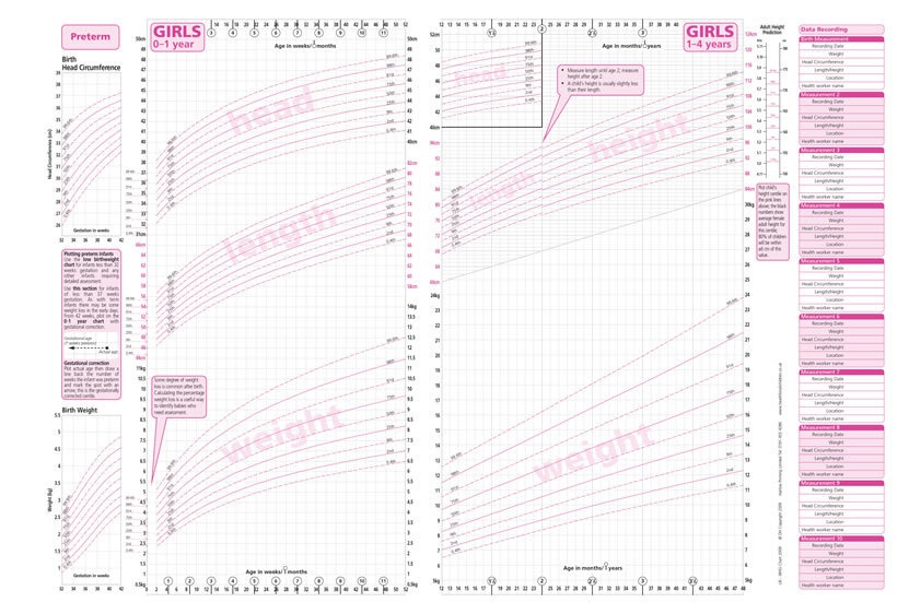
In order to understand what statistically the lines mean, I would recommend to envisage the chart as a series of normal distributions.
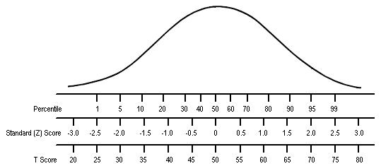
Instead of the way we are used to seeing normal distributions (a horizontal ‘bell-shaped’ curve, like the diagram above) we get rid of the curve, and orient these normal distributions vertically. Normal distributions are plotted on the graph vertically for each cohort of children. (I’ve just shown 3 normal distributions, but in the real charts these statistical measurements are at intervals of 2 weeks of age or closer.) You get the idea.

How we use growth charts
- A clinical practitioner would take a measurement such as Height or Weight of a child, using a normal height measuring tape or weighing scales. On its own, it’s impossible to tell if a single reading is normal for a child as we do not know what stage of growth they are in. But by plotting the measurement on the chart, we can get an idea of how their growth compares to their peers at exactly the same age. Even better, we can then take several measurements over a few months. This helps us to tell the difference between children who are just naturally smaller (they will be small but will follow the curved line) and those whose growth is faltering (they will fall down through the curved lines). And we can detect other things such as obesity and certain genetic conditions.
What is a centile?
- The term ‘centile’ is short for ‘percentile’. If a child’s height is on the 50th centile/percentile, it means that 50% of children at their exact age are shorter than them. They’re probably in the normal range. If a child is on the 6th centile/percentile, it means that 6% of children are smaller than them. Small, but still probably in normal range. If a child is on the 0.01th centile/percentile, this might represent normal for them, but the probability that it is outside of the normal range is higher, and therefore would prompt investigation.
How do we get centiles at the moment?
At the moment, we have to plot height or weight manually onto a printed A3 card version of the centile chart. This worked well for many years of paper notes, but now we are increasingly using digital health records, and a huge piece of card doesn’t work well with digital records.
Next: Part 2: The Problem(s)
